
flyboy0681
-
Posts
6,123 -
Joined
-
Last visited
-
Days Won
7
Content Type
Profiles
Forums
Blogs
Gallery
Downloads
Events
Store
Everything posted by flyboy0681
-
Quote: allsmiles I have waited for ever it seems for somebody to come up with a new tech gps/nav/comm. I never liked the 430/530. I thought it was Garmin's first attempt at it and a bit cumbersome. Finally they did! So I'm going to update my panel. I'm taking out KMA 24, KY197 comm, KNS 80 nav, kr 87 adf, kt 76A tx and decommissioned Loran.
-
Oh, almost forgot. The GTN comes with two DVD's, one of which contains simulator software. Garmin really outdid themselves with the GTN simulator as it's an exact replica of the real thing, and as far as I can tell, it contains the entire US database. It also includes a simulator for the G600, which can be inter-connected to the GTN for some heavy duty training sessions.
-
In the event the unit dies, the COM is supposed to automatically switch over to 121.5. But if it dies, 1) how does it know to switch over and 2) what if the unit is so dead it can't phone home?
-
Although it was light chop, I didn't have any problems punching in what I wanted. I think this will turn out to be a non-issue which garnered a lot of concern early on when the concept of the touch screen was first mentioned in press releases.
-
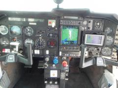
I finally had a chance to fly with the GTN750 today. It’s quite obvious that Garmin took their time and sought input from pilots when developing this system. As we all know, manufactures and software developers don’t always take users into account when designing new systems and we are often left scratching our heads why things were designed the way they are. I am happy to report that Garmin put a lot of thought into the new system. The functionality is well thought out and easy to work with. My initial impression was the screen. It’s big, bright and extremely sharp with excellent color presentation. I liken it to looking at a high resolution photo on an iPad. When moving along, the "ownship" symbol moves smoothly along the route, not the every second update where it "jumps" to the next position as on all other systems. Entering a flight plan is as simple as Garmin portrays it in their promotional material. Either go to the flight plan page and enter the waypoints manually (by punching in the identifiers) or drag your finger along the screen to the place you want to go, with points along the way. I entered a simple flight plan manually and decided to insert a waypoint by simply dragging by finger and “rubber banding” the new point. I then pressed a button on the screen and it was inserted effortlessly. When asked what the best part of the system is, I would say it’s the wealth of information displayed on the map page. For those installations like mine which do not have the integrated transponder and audio panel, the top portion of the screen displays all of the information that you are accustomed to on the 4/530W from the default navigation page, such as the Desired Track, Distance, Speed, ETE as well as a CDI. This does not show up in the Garmin promotional material because they are always displaying installations containing the remote transponder and audio unit, which displays their own related set of goodies occupied in the same space at the top of the display between the COM and VOR frequencies. Another great thing in addition to the default navigation information is the ability to select other information that you want displayed. The screen has four data fields which you can customize simply by touching the field on the screen and selecting the item you want displayed from a long list of 24 different choices. This is a great feature. But better yet, for those of you that share the plane, you don’t have to live with the default values somebody else setup. On the GTN you can set them on the fly. No more wading through multiple levels of confusing menus to get the items you want. The ease of use is something one has to see to believe. You are never more than one key away from the menu. The number of setup options is impressive and it’s very easy to customize things to just how you like them, right down to the volume of the touch screen clicking sound. Well done Garmin, well done. Selecting frequencies is a blast. Bring up the airport and touch the frequency tab to display a list of frequencies. Tap on the one you want and it’s placed in the standby corner. My brief flight did encounter slightly choppy air and entering information didn’t prove much of a problem. I also employed use of the concentric knobs for entering frequencies manually to see how well it works. I think the people from Kansas have a real winner on their hands. The only thing conspicuously missing is a reminder to switch tanks. I looked high and low and couldn’t find it. I know there are some customizable timers so that may work somehow. More to come. [ Sorry fellas, I have some pictures to upload but the site crashes each time I try to attach them. I'll keep trying.]
-
Just for curiosity sake, does anybody know of a Mooney owner that put in a IO-390 in place of a 360?
-
Quote: RJBrown Took off 100 usable planning 20 gal hr/200 kts in a Rocket.
-
With my electric unit I have to push down hard on the bar to gain traction. This is literally where the rubber meets the road.
-
I guess the Mooney is just so well suited for such a mission that it's the RTW plane of choice.
-
I won't be climbing into the left seat until late next week. The initial reports from my partner is that although the unit is intuitive for the most part, there's still a lot to learn and studying the manual is essential.
-
Last week I came across this site, a guy who back in 1998 flew his J around the world solo. http://www.priortrip.com/
-
From the album: #flyboy0681's album
-
From the album: #flyboy0681's album
-
From the album: #flyboy0681's album
-

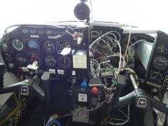
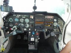
Panel as it looked upon arrival at the shop
flyboy0681 posted a gallery image in Old MooneySpace.com Images
From the album: #flyboy0681's album
-

From the album: #flyboy0681's album
-
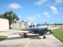
Old, original paint parked outside of Willmar awaiting her new buyer.
flyboy0681 posted a gallery image in Old MooneySpace.com Images

From the album: #flyboy0681's album
-
As luck would have it, Monroy is located in my town and I have met with Jose Monroy on a few occasions. His new units have the ARINC 429 chip in them but the software is not yet ready. Our shop wired the ATD into the GTN750, so once the software is ready traffic will display on the new unit. I don't believe (although I could be wrong) that the Aera has an ARINC 429 input.
-
I've been called a lot of things in my day but PIA is not one of them. My trips there weren't to check up on them but to deliver stuff such as the ATD-300 unit and then another trip for the antenna then another for equipment that was being traded in.
-
Quote: LFOD Can I ask how many hours of labor they charged you for the install?
-
Gary hit the nail on the head, backup system with integrated Wx. We've been looking at the GDL-69A and just can't justify the $5k price - or even the $3k that they are going for on eBay. Besides, the net cost for the 510 after trading in the 496 was $100, so why not?
-
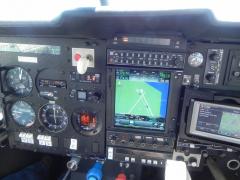
After two and a half weeks in the shop, here are the results... The only issue is the angled cradle for the Aera 510. It's blocking the right panel and the KX-165 under it.


-
Although my hangar has a nice thick yellow line right down the center all the way to where it meets the taxiway, it still takes me 5 or 6 maneuvers to get her in correctly. Most of the time she's in at an angle and I just know that one day I'm going to hit the elevator where the building narrows towards the back. I have an electric PowerTow and it doesn't make the job any easier, although I don't have to push very hard but the cord is a royal pain. My partner pushes the plane in perfectly in one shot. I aspire to be just like him someday. Down here the most useful hangar accessory is a giant fan.
-
Garmin already demonstrated voice commands for the audio panel so I assume dictating a route is just around the corner.
-
These are all unknowns at this time, but given Garmin's reputation for quality, I wouldn't anticipate any major problems.


